LOGO
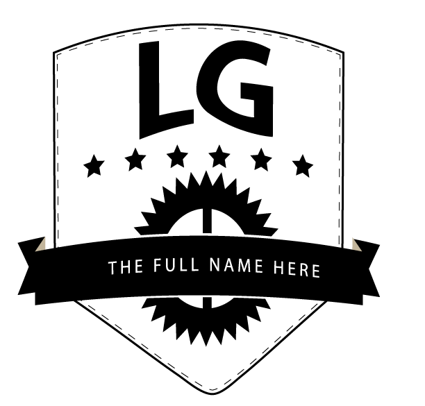
Now, let's look back at our sketches and choose a shape to build. Normally, I'd do two or three for a client but for our purposes, just creating the droplet shape will do. When making a logo, it's best to start with black and white, using negative space to build a shape that can work with just one colour.

Start with your boundy form
Create new letterforms
Clean up the shapes
Begin creating the ribbon
borders
edges
positive/negative
double lines
outline
orginal


