American Broadcasting Company
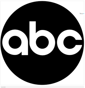
Paul Rand 's 1965 redesign of the trademark for the American Broadcasting Company reduced the information to its simple essence while achieving a memorable and unique image. The continuing legacy of the Bauhaus and Herbert Bayer's universal alphabet informs this trademark, in which each letterform is reduced to its most elemental configuration.

 About
Paul Rand
About
Paul Rand
Paul Rand’s stature as one of the world’s leading graphic designers is
incontestable. For half a century, his pioneering work in the field of
advertising design and typography has exerted a profound influence on the
design profession; he almost single-handedly transformed “commercial art” from
a practice that catered to the lowest common denominator of taste to one that
could assert its place among the other fine arts. Among the numerous clients
for whom he has been a consultant and/or designer are the American Broadcasting
Company, IBM, UPS and Westinghouse Electric Corporation. His vast experience has included magazine and advertising agency art
direction, packaging, book illustration, and typography, as well as painting
and art education.
List two contributions Paul Rand made to the field of design?
What is similar between Herbert Bayer's universal alphabet and the font created by Paul Rand?
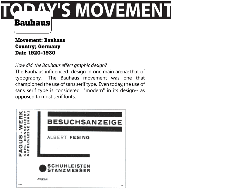
What was the Bauhaus?